Monday, 3 December 2012

camera and deception.

camera the camera can be very deceptive. We sometimes cannot depend on photography as proof or sources. Especially with photoshop etc. But even without those do we truly know what we are looking at when look at photos. we are seeing what the photographer wants us to see.
kodak brownie
thornton pickard An excellent example of an artist / photographer is James Casebere.
his work is NOT archictecture and even at that the architecture is not the finished product! what you are looking at is actually a mini model of architecture and the final pieces are the huge photographs he takes of them. I tried this for myself its crap. but adleast i tried!
here is another set.. but this one is a work in progress:

week 4-5

Week 4-5 Visual texture What does visual texture bring to what I was talking about? I think visual texture can be a great tool like video to play with perception of the viewer. It can be ironic and deceptive. The artists I looked at for this were: -Alice Maher
The thorn house is the most relative to me. its a house which reminds us of home. Home should mean a safehaven, a sanctuary. But she has made this little house out thorns which completely warps our interpetation. Now it displays things like danger, hurt and fear
The nettle coat is another object of irony. A jacket is made to be worn, right? even if its made with Real nettles?
The berry is brilliant because on first look we see a cute little girls dress. its covered in berrys? how sweet on if you see inside the berry are fixed on via pins. As a result of looking at Alice Maher I came up with some 2D work.
here i explored texture and materials to lay them out and see the effect they have layed out together.
thorn teddy bear again heavy influence from Alice Maher';s Thorn House. The thorns make the typical childs toy that little less cuddly.
This is a little more destructive art again. ive made a cup and teacup drawn in thorns. they are burnt around edges. there is frame around them. this brings paramore's playing god back into it again. last one
This isb a bed of holly leaves, once agian playing on the irony of comforting objects being made into something uncomfortable and sinister. .

Week 2-3 ctd...

Week 2-3 ctd... I look a little more at creating dark, atmoshere to trigger emotional responses. Im looking particularly at fear, tension, decaeption and eerie. what makes a space scary? who is in it? what colours create it? how big or small is it? how important is light? I looked to two music videos: Playing GOd- by Paramore
http://www.youtube.com/watch?v=iDy2wCQYSrU I really like this because the theme is guilt and deception. The bright colors and sepia old style filter is ironic. In the video it shows guilt, through the tension in the main character and all the religious iconography displayed in her car. there are effeminate things like flowers and delicate tea sets.When she invites her friends for tea it's revealed through flashback, she has kidnapped her bandmates. We see a strong element of theatre by the red curtains. She is trying to cover her paranoia and guilt. Is this what makes it tense?? Lithium - by Evanescence
http://www.youtube.com/watch?v=PJGpsL_XYQI in this video we see the singer i9n her own dark, winter wonderland. there is snow, its dark she is alone and there is a gothic twist to the world she is in. We feel the cold through the color and the weather and there is submersion in the little dark pool. In the start we are shown the singer playing the piano in a dark niche created by trees formed in to an archway. LIghting above water is the same as below. THis is more work I came up with as a result. The work below is scary, dark and unnerving. Work 1 and 2 take heavy influence from the videos from above.
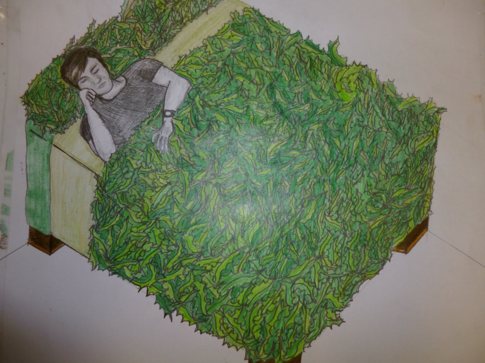
 1
Image one is a woman hiding or covering by this vine-like layering. She can see you but you cant see her fully. this goes back to my point from week 1. I wished there could be a way to be hidden but still be able to see what goes on around you. 2
Image two is destructive art i drew a face onto wallpaper using pencil and charcoal and tore all around the edges then cindered the edges with a lighter. 3
This image shows deception and terror. its having a monstrous or having to look at thing twice sometimes 4
i took influence from one of my favourite series Supernatural. The research they do into the myths the show is incredible. here i've taken from theIR inspiration of lampraids. theY studied lampraids in order to create their Changeling.
heres thev devil in the detail http://www.youtube.com/watch?v=2LzvVa8-6GE

week 1-2

WEEK 1-2 the womb symbolizes a internal, safe and warm place. This captures how i felt on the first week of college. I am straight out of secondary school into a space full of creative people like me. i am nervous and would give anything to
retreat into the womb
2D research and work. This is the research i did. *the rest is in my contextual notebook* I looked at 4D scans and sketches of wombs like Leonardoo da Vincis sketchbook. I also looked up installation art of wombs. Some artists I looked at were:@ -The womb like hush-chairs by Freyja Sewell -Performative sculture, "wild at heart" by swiss artist Victorine Muller -"land mind" by Paula Hayes
Above is the research, Below is the result

Tuesday, 20 November 2012

Art for arts Sake!


THINK OF THE CREATIVITY!!!
Hello! The latest creative people's work I admire is that of a reduce, re-use, recycle nature. These are the things now, that make you scream to the Heavens:
                           "Lord, Why didn't I think of that?!"
It was a typical days research. I was looking up old TVs as a form of atmospheric, staged media when suddenly the words...TV-turned-fish tank just happened to get my attention. I looked into it and just look at these! Is it not one the most coolest things?
Does this have soarview???

This cat truly appreciates the arts!

Because we all know how our fish are masters in the field of botany...
Just another day in the office for Bob.
Even the kids are tired of the movie Finding Nemo...
Back to business... what possible links could TV-turned-fish tanks have with my project? (if it didn't work, I'd have made it work! ha) well my project is My Space. The Space I decided to talk about was my mind space.
I wanted my project to be an investigation as to what I think my own mind space would look like if it were put into harsh reality.
 That led me to look at visual texture... which made me look at Alice Maher, Guerra De La Paz, Cornelia Parker and the like...
Which in turn led me to look at media as the best way to portray my Mind space.
I felt the best place in reality that as something as dark, dramatic and atmospheric as my mind, was theatre and TV. Before I found the fish tanks, i wanted to make a "TV" (using projection) and here are some of my own work i considered using as video that i would use in it:


Heres my favourite one, because it involves submersion. giving a whole new type of life to a space.
But the fish tank TV also made me think of Submersion. Submersion makes me think of the senses reaction to being underwater. The a buzzing silence, your actions are slowed down, you don't breathe and depending on the water it will filter light or it will be dark. It brings me back to the mind space again.
So indeed, there are some creatively, practical people out there... Makes me wonder if I would could be among the Elite!

Other more unusual ideas were also found it wouldn't be my blog if I didn't carry out the duty of showing you the weird, wonderful and outright creepy takes on a similar idea!
                                                                Weird....
                                                        Wonderful...
                                          OUTRIGHT CREEPY!!! Imagine the poor fish, huh?


Wednesday, 17 October 2012

New Week, New Direction

This (3rd -4th ) Week
well it's decided, for now I'm looking at my project: to sense my space through visual texture. So, what does that mean well... it means the artists I'll be paying particular attention to are Christian Bolt, Cornelia Parker, Alice Maher and many, many more!

It seems as though visual texture is the medium that appeals to me most, judging by the research I did. That research involves the artist stated above. I know that is still broad but plenty of time yet! :)
My aim is to capture a how both texture and visual aspects of a space can trigger an emotional response.
Or alternatively how I can manipulate these aspects to get a deliberate response. I love installations, particularly light installations! I love how the lighting, a small aspect can make a space seem so characteristic and expressive. That transition from a small thing to a big thing, reminds be of  thought process/formation. A thought being born and becoming an action...

One Particular event I keep coming back to is Vivid Sydney Light Festival 2012... the piece that caught my attention was Underwater by David Clare. It is a projection on water giving an eerie, dream-like quality. http://www.youtube.com/watch?v=F3rJYtoeLqU check it out (apologies for the poor quality)


one particular that inspires in many visual textural ways, goes by the name: thisiscolossal click the link: http://www.thisiscolossal.com/page/2/ Artists I admire on the site are=

*Carolina Fontoura Alzaga who works with old bicycles parts to make chandeliers! Amazing! The unique choice of medium would give any given space a character.

*David A. Reeves who stages these dramatic, silhouette scenes using cut-out paper! Paper suddenly tells you a story, I love his simplistic choice of medium and his dull lighting. The result is tha of a movie still!


*Anna Shirron
http://www.annashirron.com/
I really like how simple this piece is! There are so many ways this idea could be taken.
It can be purely for art, or be made into something with an aesthetic function in interior design... the list is endless.


*The glowing firefly squid of Toyama, Japan
http://imgur.com/taQHH 


 I know this technically is art as such, BUT look at it! Nature can be all about visual texture.
I think this image can be a great source of inspiration.

Other Visual Artist worth checking out are:
 

Tuesday, 16 October 2012

Installation, Installation, Installation!

WEEK TO 3
The Installation Investigation

More installations this time...
  I've found more on various blogs ie:
  • This is colossal (http://www.thisiscolossal.com/)
  • My own pinterest account (Shauna Callanan boards: It's an Art Thing really & Exploration of Space (3D & Literal)
  • My own Tumblr Account: Sophiasilke32
I have found LOADS! 
So here are some of the critically selected...

Caitlind R.C Brown


http://incandescentcloud.wordpress.com/about-the-artist-2/
CLOUD, An Interactive Cloud made from 6,000 light bulbs, genius.

Bartek Elsner

Cardboard Sculpture
Ah yes, cardboard that wonderfully humble material...

Su Blackwell (Set Designer, artist, Art Director)
 
Su predominantly works with Paper... I'm actually not sure what this piece is made from. She has worked with the rose theatre, London.
I might comeback to this artist again, as I've struggled to find set designers...

Bruce Munro
translucent silos constructed from bottles.