Thursday, 21 March 2013

My Elective? Animation!


 ABSCONDER

Absconder - to run from some thing or one. Esp: Persecution.
This video is of two people designed to look like the people featured on signs (exit, Entrance, Exit etc..)They are running away from where they belong.
The music is Kittie - Run Like Hell ( A Pink Floyd Cover)
The result of two weeks is in! I hope it paid off! 
I will write up the research behind this tomorrow.
Aswell as upload photos of the mini evolution of the storyboards for Absconder.
I will also explain where i got my idea and how it developed.
As usual, any contextual work (Relevant or Otherwise) will either be on my Pinterest or Tumblr.

Pinterest (on the board Animation Fixation):
http://pinterest.com/conniesurrency/animation-fixation-d/

Tumblr:
http://sophiasilke32.tumblr.com/

Friday, 1 March 2013

Animation Rotation CTD...

Animation is finished...
What NOW?
No idea, but for the hell of it, I decided to prove how freaked out I was about not being able for Flash of After Effects. I'm putting up a snippet of my
Back-up Plan... (yes, there I said it!)

My back up plan was inspired by William Kentridge's-Automatic Writing (pinterest link on other post) its charcoal-mation and being a huge fan of the medium (used it in the Mums the Word too)
I gave it a whirl.

The story is based on the line "I noticed You Around"
The story is a girl on the streets at night. She notices and is noticed by a obscured figure of a person dressed in dark clothing. Its ambigious, its up to interpation of who notices who and whose perspective is it from? and more importantly what does it mean for those involved?

Thursday, 28 February 2013

Animation Rotation

Animation

So I'm doing my Animation elective. Exciting stuff and I had no problem finding amazing contextual material!
All my contextual research (video) is on my Pinterest Page, on the board Animation Fixation at:
http://pinterest.com/conniesurrency/

I particularly love nearly any form of Stop-Motion! I have an interest in claymation and I'd love to one day develope 3D/CGI skills. But since there's only 2 weeks I had little time to waste.

I decided to use a Cartoon Style inspired by the design of the Cartoon by OneyNG on Youtube by Chris O'Neill & Sean Kiely called:Leo and Satan (Pinterest.)
   They use heavy lines and rich, block colours. (basic shadows)
I was going to draw out my sets and characters. But it wasn't as Stark as I was hoping it would look. Instead i used my own pictures and simply drew over them in photoshop. That gave it the 'look' I was aiming for.
Next I put the whole lot into flash. It was my first time using a program like this ever before. I wont lie it was treacherous at first, but when I got it there was no stopping me.

The line I had chosen from my brief was: "I told you so" the idea behind it is simple. Its around a typical mum, son and home. Like any other little boy and his mum, she tells him not to do something he goes ahead and does it anyway.
I broke it up to centre the story around 3 scenes/sets kitchen, trampoline and bedroom.
I only needed 3 characters: Mum, son and friend.

I'll let you see the narrative for yourself!


Friday, 25 January 2013

Sculpture Rotation 1

STAGE 1 
Before I started working in 3D, the class had to brainstorm words that link with 5 senses.
After that we had to change some of those words to verbs.
I ended up choosing: Pulse or to Pulsate.
This lead me to think of a new word= the heart. 
 

STAGE 2 
I thought about the sound the heard makes, the beat.
the sound is generally consistent.
I listened to my own heart and tried to imagine that I had no idea what a heart looked like.
the noise is almost mechanical. it makes me think of something man-made (manufactured)
But then I looked up heart surgery on tumblr and google.
seeing the heart out of the body allowed me to see what it actually looks,
 
but more importantly how it moves. It moves in this jolting, frantic, elastic way.
the material that sprung to mind was rubber bands.
 
STAGE 3
With the entire side of my desk covered in rubber bands and wool for color,
I decided to spread the work out into the room. So the room becomes the body and the desk, the heart. the beat is spread throughout certain parts of the body and thats the reason I did this.


Thursday, 10 January 2013

Stopmotion Animation of the Clare Glens.

A simple by appearance but dont be fooled it took ages for my to finally be happy with this video!
It took 23 videos similar to this to find the perfect one!
The music artist I chose for this one is:

Gorrilaz - Sound Check (Gravity)

Other Music I considered was
Evanescence - Secret Door
Paramore - Brick by Boring Brick
30 Seconds to Mars - Welcome to the Universe
The White Stripesn - Hardest button to button
The Automatic - Monster
The Foo Fighters- Long road to ruin.
 I felt the other music implied there was a narrative, when reaaly its just to show what the walk is like without the excersise! ha
This is the first animation I've ever made!


Monday, 7 January 2013

next idea.. WARNING not for the faint hearted!

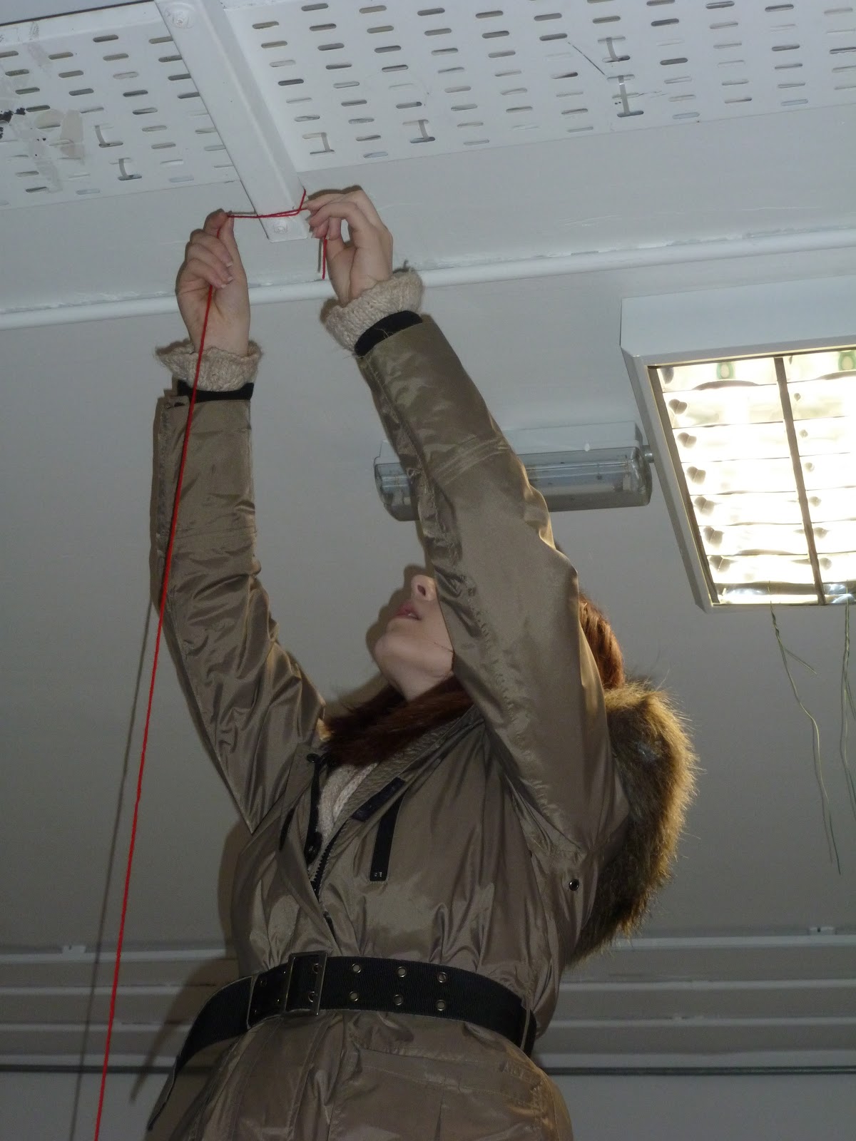
THE NEXT STEP... I recently passed my theory test, yay! It made me think about actually driving, you need to be aware of the space around you at all times. I thought about the consequences if you dont... -so I collected seatbelts -I collected mannequin limbs -I painted a wooden frame black My plan is to mount them all on and to weave the belts and the limbs through the frames. heres the first step... Paint the limbs! Attempt 1:
Attempt 2:
I have yet to finish it... But adleast the idea is out there! haha Please excuse how morbid it is!

progress of mini set making...

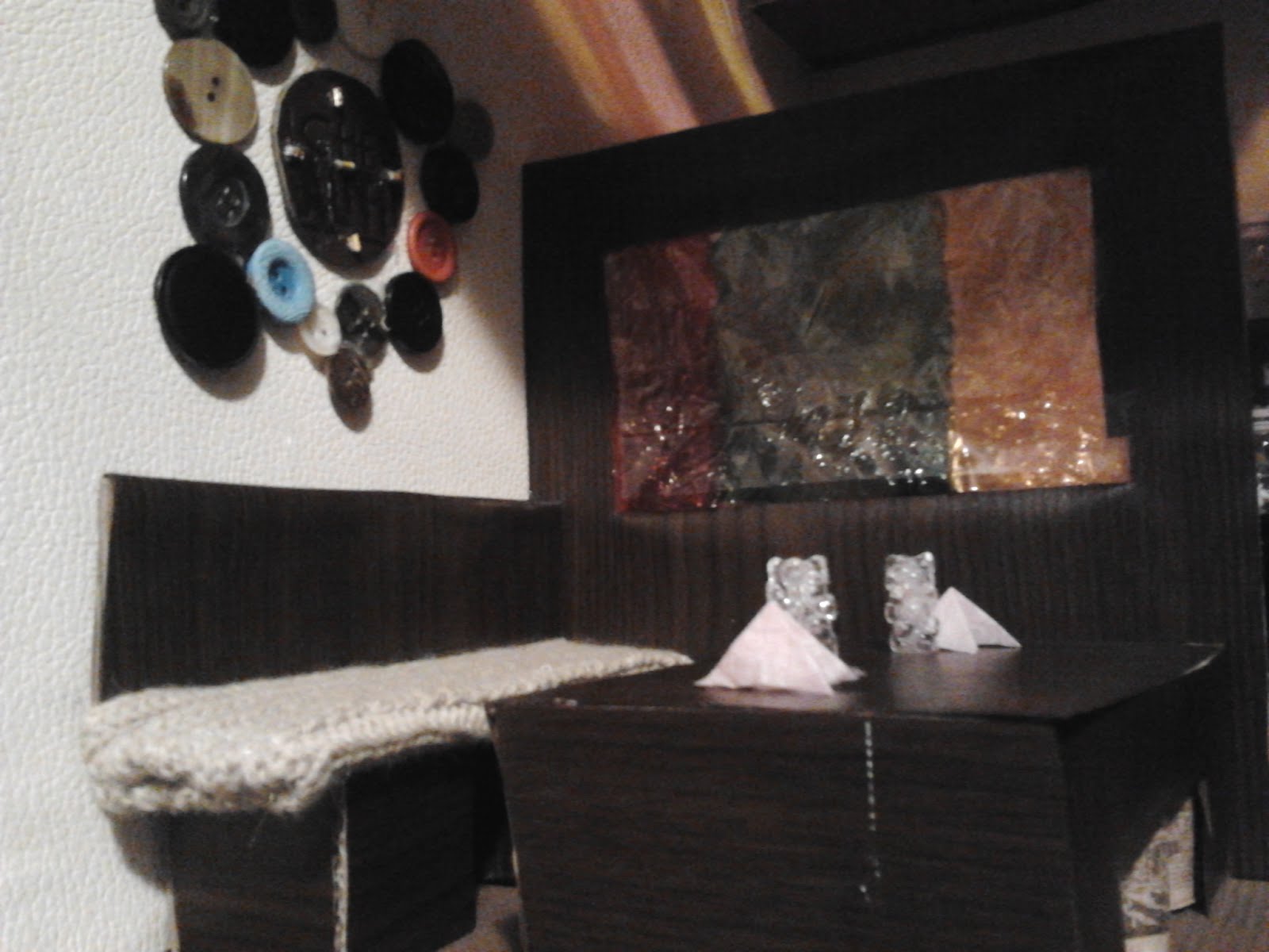
Here I'll show you step by step how I created this smalll space. With the help of the photographs of the work, I hope to show how decptive the space is. It is created to look bigger than it is. 1:
2:
3:
3:
4:
+
5:
6: (final peice)
-I used everything i had around me! haha -But the main tool to have in making one of these is a hot glue gun. -The glasses you are seeing on the table in the 6th images are beads glued togeter. -The shiny shelf in the backround is no more than a peice of sequin top and cardboard. -the entire box is cardboard, with a wooden plank for a floor and a perspex sheet for a 'window' -the floor and walls are covered in wallpaper. -the windows are covers in sweet wrappers to get the coloured light shining through -the table is cardboard, wood contact and wine bottle corks -the chair is cardboard, contact and woollen material -the tissues on the table are tissue paper -the door handles are broken bracelets and -the coat hangers are copper staples!

theatrical

Theatre
the baroque theatre. Cesky krumlov
the unknown theatre museum. The museum is open for the public. Its located in Gäddviken, Nacka. 16th
The National Grand Theatre's second Olympic special, Madame Butterfly Theatre has really come along over the years. its now a very contemporary and equally as popular to us now as it was back in the day. it pulls in all the characteristics i wish to manipulate in order to best represent my mindspace. heres what i did : Practising making curtain rails...
Then my finished peice... 1
2
3
4
-This peice is 5,7 metres in height. -Its compoesed of boxes and materials (cardboard, wire, maslin, cotton) -it placed on a wooden stand and the material is draped carefully around it. -the point of the theatre is to be a backdrop. To an stop motion animation i created with images from a nature walk near my home.

Monday, 3 December 2012

camera and deception.

camera the camera can be very deceptive. We sometimes cannot depend on photography as proof or sources. Especially with photoshop etc. But even without those do we truly know what we are looking at when look at photos. we are seeing what the photographer wants us to see.
kodak brownie
thornton pickard An excellent example of an artist / photographer is James Casebere.
his work is NOT archictecture and even at that the architecture is not the finished product! what you are looking at is actually a mini model of architecture and the final pieces are the huge photographs he takes of them. I tried this for myself its crap. but adleast i tried!
here is another set.. but this one is a work in progress:

week 4-5

Week 4-5 Visual texture What does visual texture bring to what I was talking about? I think visual texture can be a great tool like video to play with perception of the viewer. It can be ironic and deceptive. The artists I looked at for this were: -Alice Maher
The thorn house is the most relative to me. its a house which reminds us of home. Home should mean a safehaven, a sanctuary. But she has made this little house out thorns which completely warps our interpetation. Now it displays things like danger, hurt and fear
The nettle coat is another object of irony. A jacket is made to be worn, right? even if its made with Real nettles?
The berry is brilliant because on first look we see a cute little girls dress. its covered in berrys? how sweet on if you see inside the berry are fixed on via pins. As a result of looking at Alice Maher I came up with some 2D work.
here i explored texture and materials to lay them out and see the effect they have layed out together.
thorn teddy bear again heavy influence from Alice Maher';s Thorn House. The thorns make the typical childs toy that little less cuddly.
This is a little more destructive art again. ive made a cup and teacup drawn in thorns. they are burnt around edges. there is frame around them. this brings paramore's playing god back into it again. last one
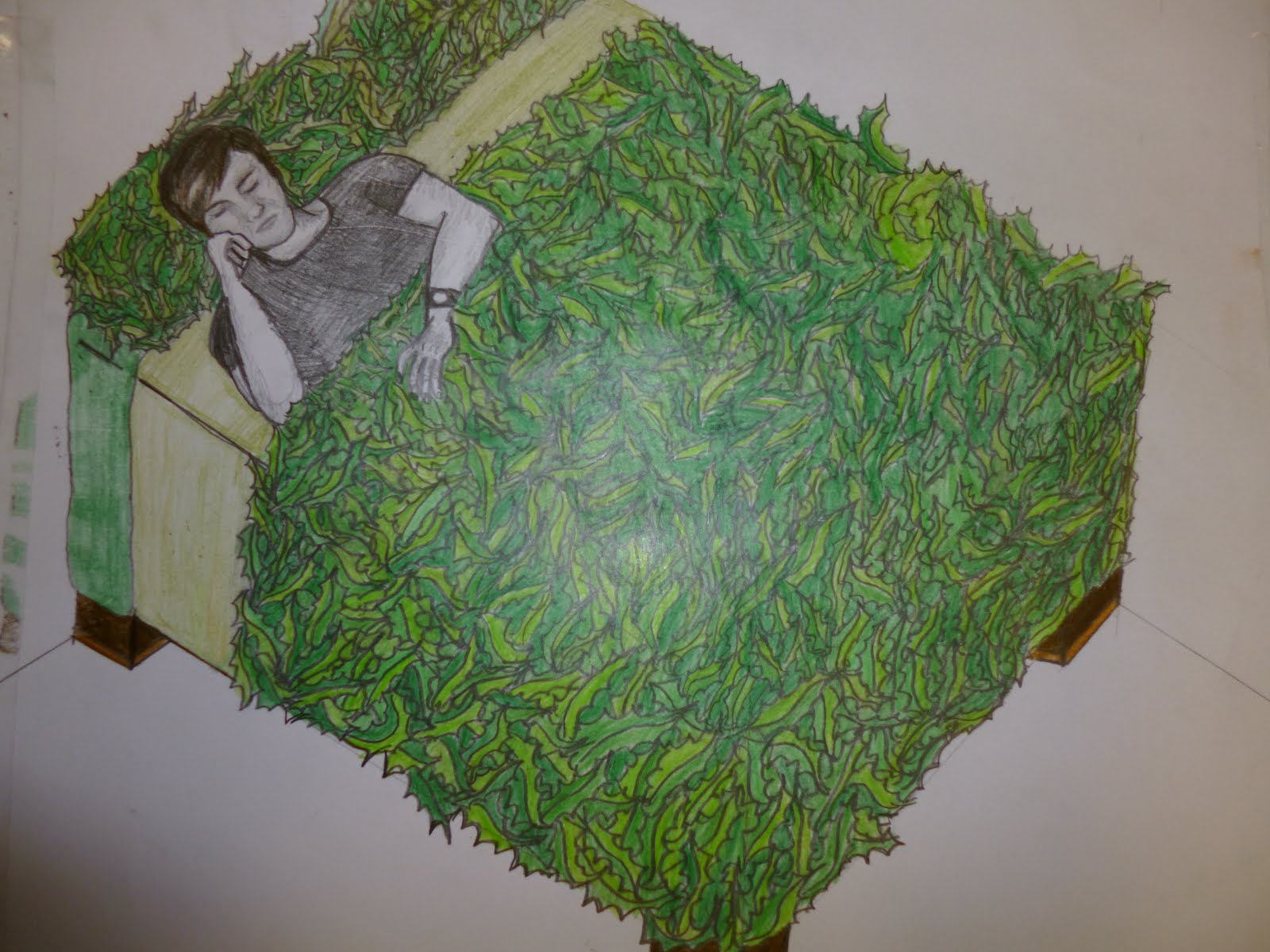
This isb a bed of holly leaves, once agian playing on the irony of comforting objects being made into something uncomfortable and sinister. .